Tenryouhai(天領盃酒)| Label logo design
I created 2 bottle label logo designs for a Niigata based sake company.
The design brief was specific in terms of a tribal theme and one that represents the brewery on Sado island.
Outside of that, I was given freedom to research and experiment with ideas as I wished.
I was humbled that the client wanted to put my name on the back of both bottles and I was proud to see him as well as his team featured on a Matsuko Deluxe TV program as well.
Some important takeaways from this project:
+ We were able to reach the deadline on schedule and the printing of the label went smoothly.
+ Our meetings proved very useful and our communication throughout helped in reaching agreements early.
△ My low Japanese ability limited me from understanding some deeper ideas the client wanted to communicate which is why we resolved to in person meetings mostly.
- I started to study more Japanese after this project so I can try to 'read between the lines', particularly when clients are expressing more complex ideas.
△ I could have handled some of the workshops better by being more active with directing the design and not always listening to understand what the client wanted.
- As a designer, though listening and confirming is key in understanding the clients needs, I could've educated them more of the process I will take and remind them of what we have also achieved so far.
Red Cliff | Logo design and voiceover
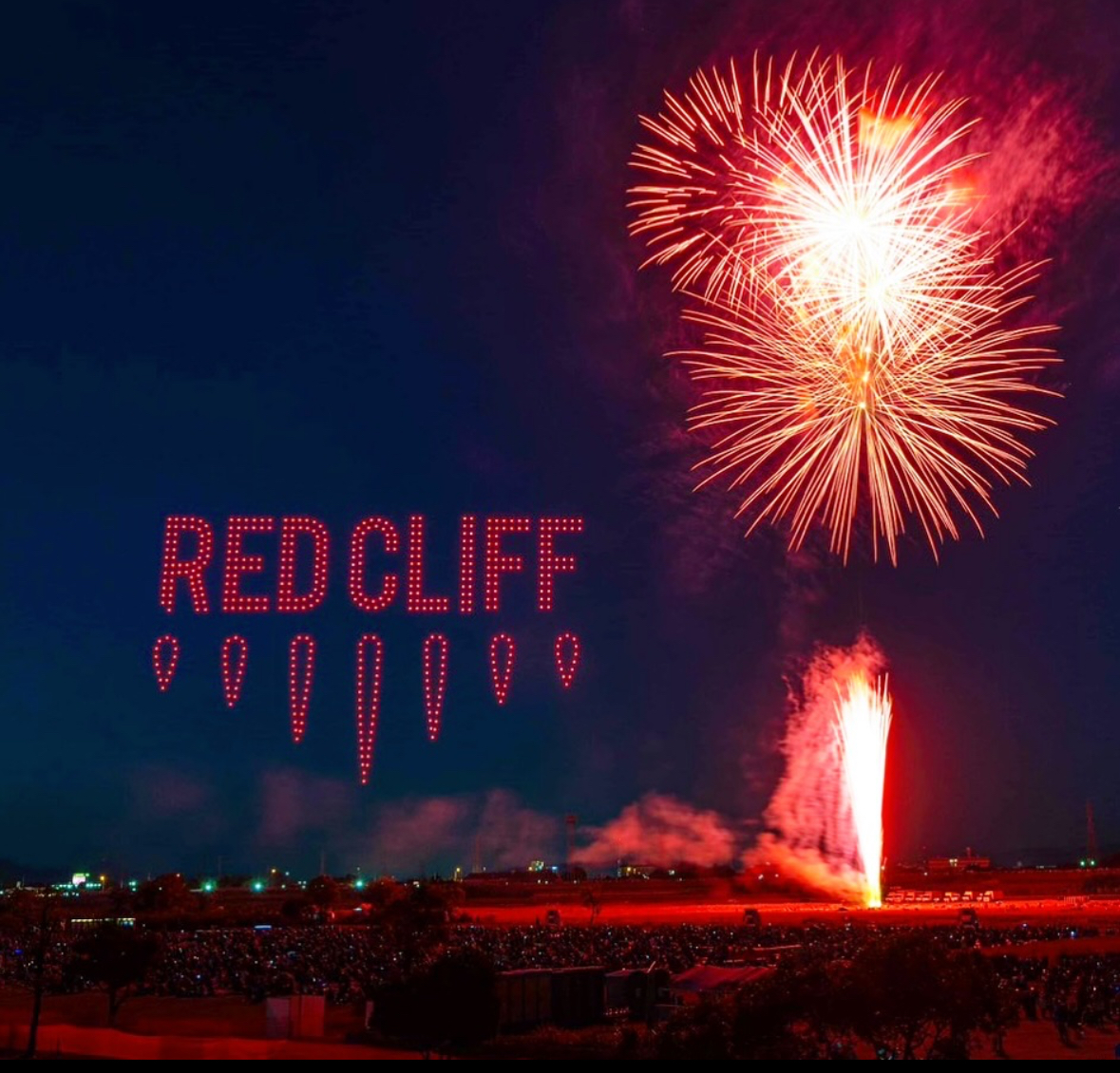
I created the logo design for a drone show company based in Tokyo.
The brief was quite open to my own interpretation and after some conversations with the client, we were able to root out the main expression of the logo through the bold colour choice and background. I was inspired by the blades of the drones for the main shape and used 7 as a reference to 'seventh heaven'. A state of supreme happiness, in conjunction to spectators reactions when viewing the drone show.
I was also called back to narrate the Yokohama and Hokkaido drone shows in June 2022.
It was a fantastic experience and unimaginable seeing my logo lit up by drones.
(More information under my 'narration' tab.)
Some important takeaways from this project:
+ The client; was very quickly able to pinpoint his needs and we came to this design in a fairly quick timeframe.
+ The unique back story to the company and its connection to Chinese drones / programming certainly helped drive the mood and feel of the direction.
△ Although this time, educating the process of the work flow worked well, there was a lot of education on my end with regards to the drone entertainment industry which made the process fun but at times difficult to obtain recent research materials / ideas.
- I tried my best to keep asking questions, no matter how small and ill-informed I was which certainly helped to speed up the work process.
△ Providing logo concept designs were fine and according to the client request, however I could've also tried to imagine more outside of what I usually mock-up, for example: in the sky with drones, more customised booth banners for conventions etc.
- This experience taught me to move forward by fully visualising not only where the design would appear conventionally but also in more unorthodox places to lineup with the businesses long term goals.
Sakura kankou travel and tours | Hot air balloon design
I created a hot air balloon design for a travel company based in Japan operating tours to Myanmar.
The design was to incorporate a harmony of Japanese and Burmese themes. Notably well-known architecture and cultural icons to promote ties between the two countries.
The hot air balloon was to be flown around Bagan, but due to the Corona pandemic starting at the same time, balloon flights were delayed until tourism increased again.
Some important takeaways from this project:
+ The scale of the design was a key factor when discussing the outcome and through simple visualisations and workshops, we were able to work towards an agreed design smoothly.
+ The story and concept sketches helped in visualising this ambitious project and discussing the printing process throughout helped to bring the whole design to reality.
△ The client was also unfamiliar with the scale of the design and the process involved so it was challenging in trying to understand if there were any colour / design constraints from the start.
- We were very forward and open in our communication and tried our best to learn throughout the process. Fortunately, we were both flexible and able to inquire about any questions in a quick manner. The client was also helpful in providing any information they found with regards to the printing process so this also pushed me to looking for English speaking printers as well to learn about budgets and how Sakura kankou can efficiently print their balloon.